
"A Picture Says a Thousand Words: Graphic Poetry with Naoko Fujimoto and Angela Narciso Torres" by David B. Newell
When I draw, I often look at my hands to see how much charcoal is left on them from my work. Each time I lift the pencil from the paper, a little bit more gets onto me. It's interesting that there is a give and take with art - no matter how much I put onto the page and call it mine, the page gives back and equally owns me. This dual relationship, of creator and creation, is why I admire not just drawing, but numerous arts. Poetry, for instance, works in a similar way, where the creator must commit themselves wholly to the work - the work is at the mercy of the writer, but the work likewise requires the writer’s vulnerability. To me drawing and poetry are dual lanes, and I’m in the median strip. For a long time I thought those two roads were strictly divided, seeing no real intersection as a possibility. That is, of course, until I found out about graphic poetry.
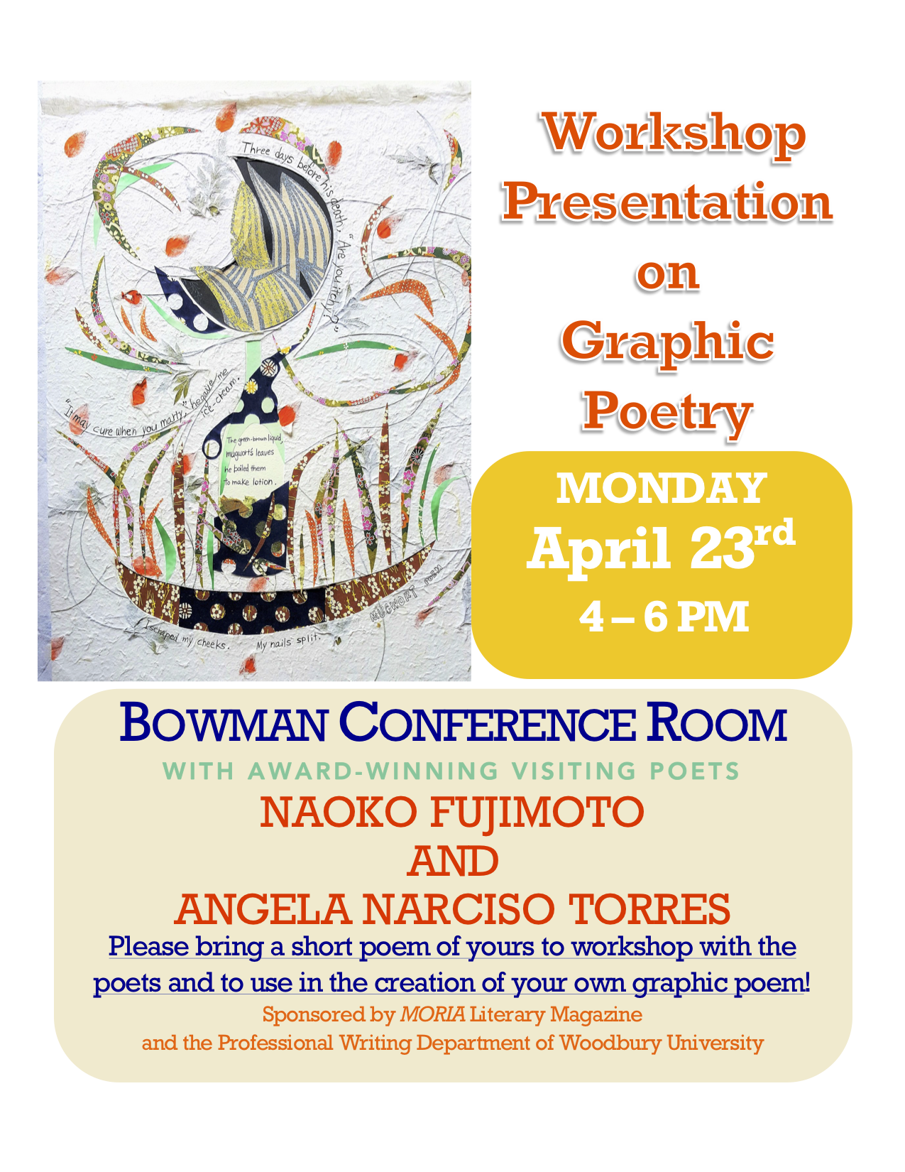
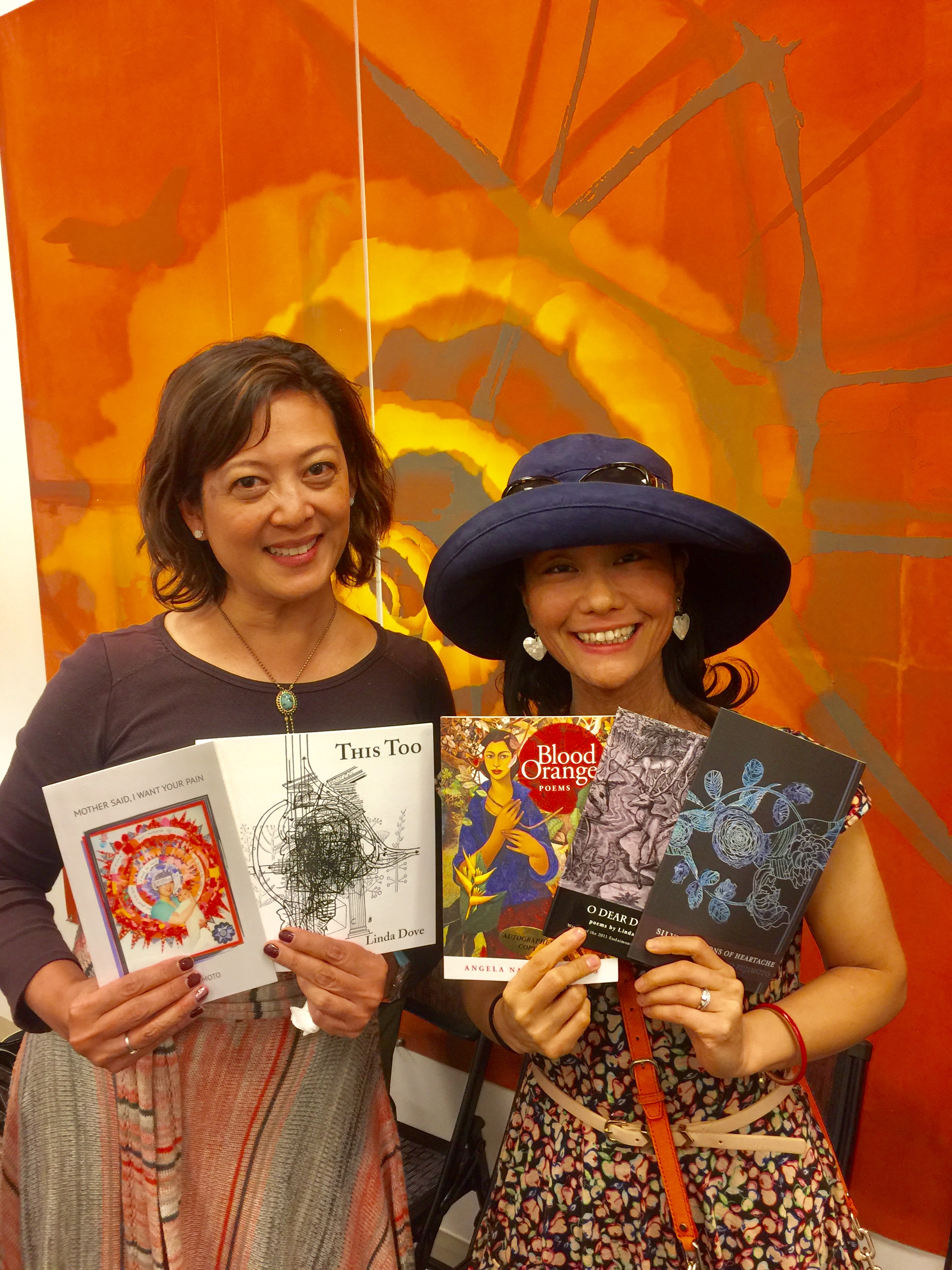
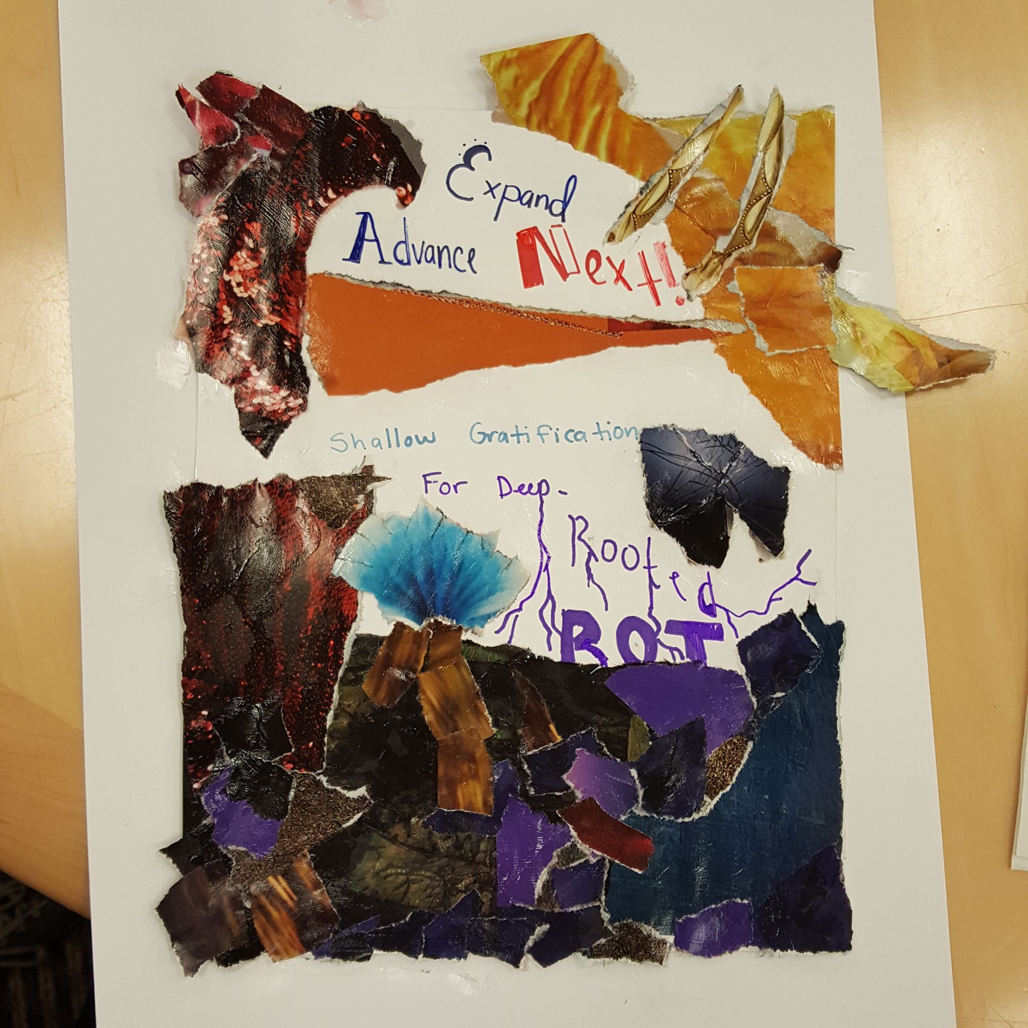
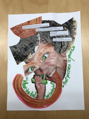
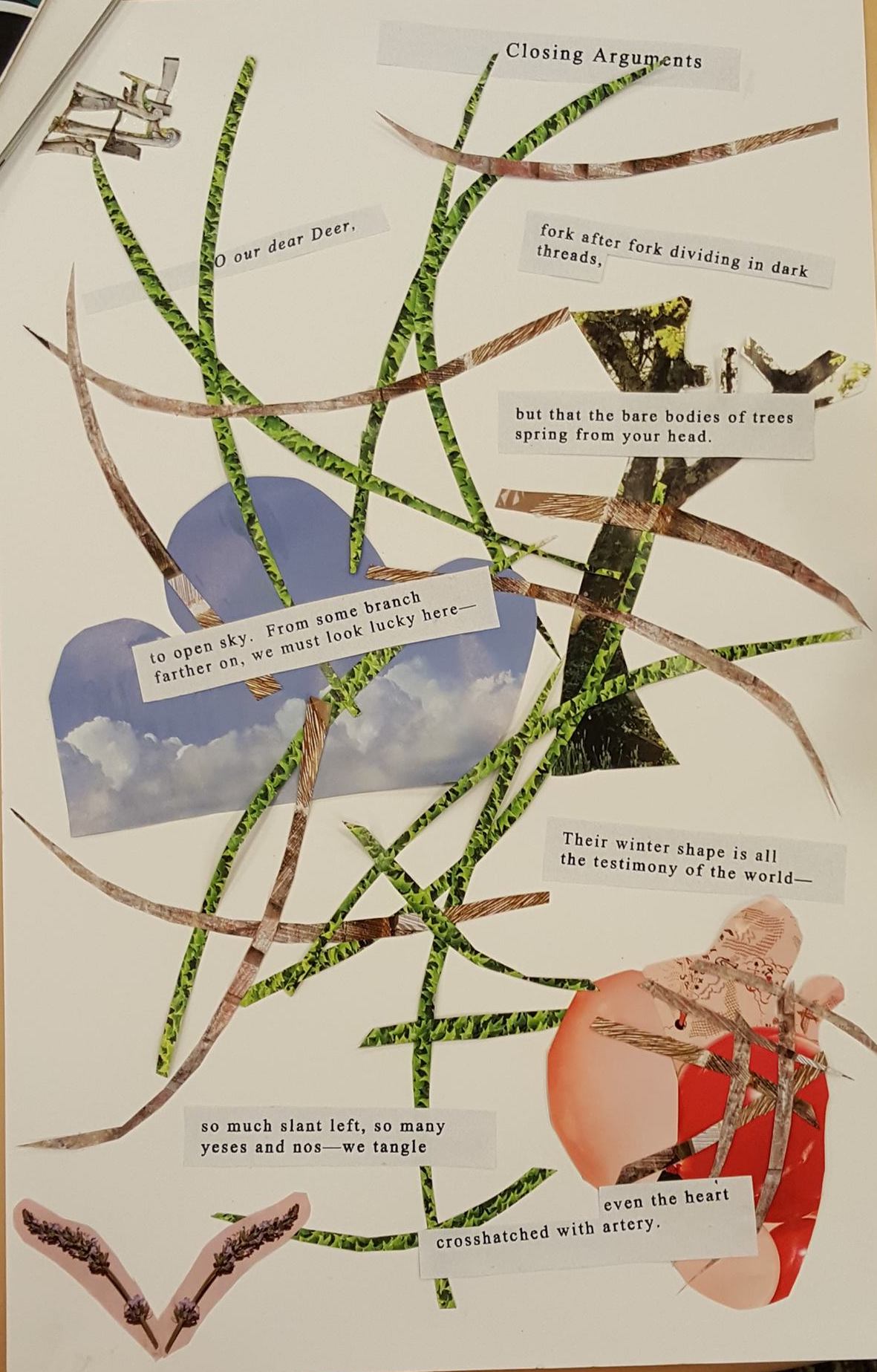
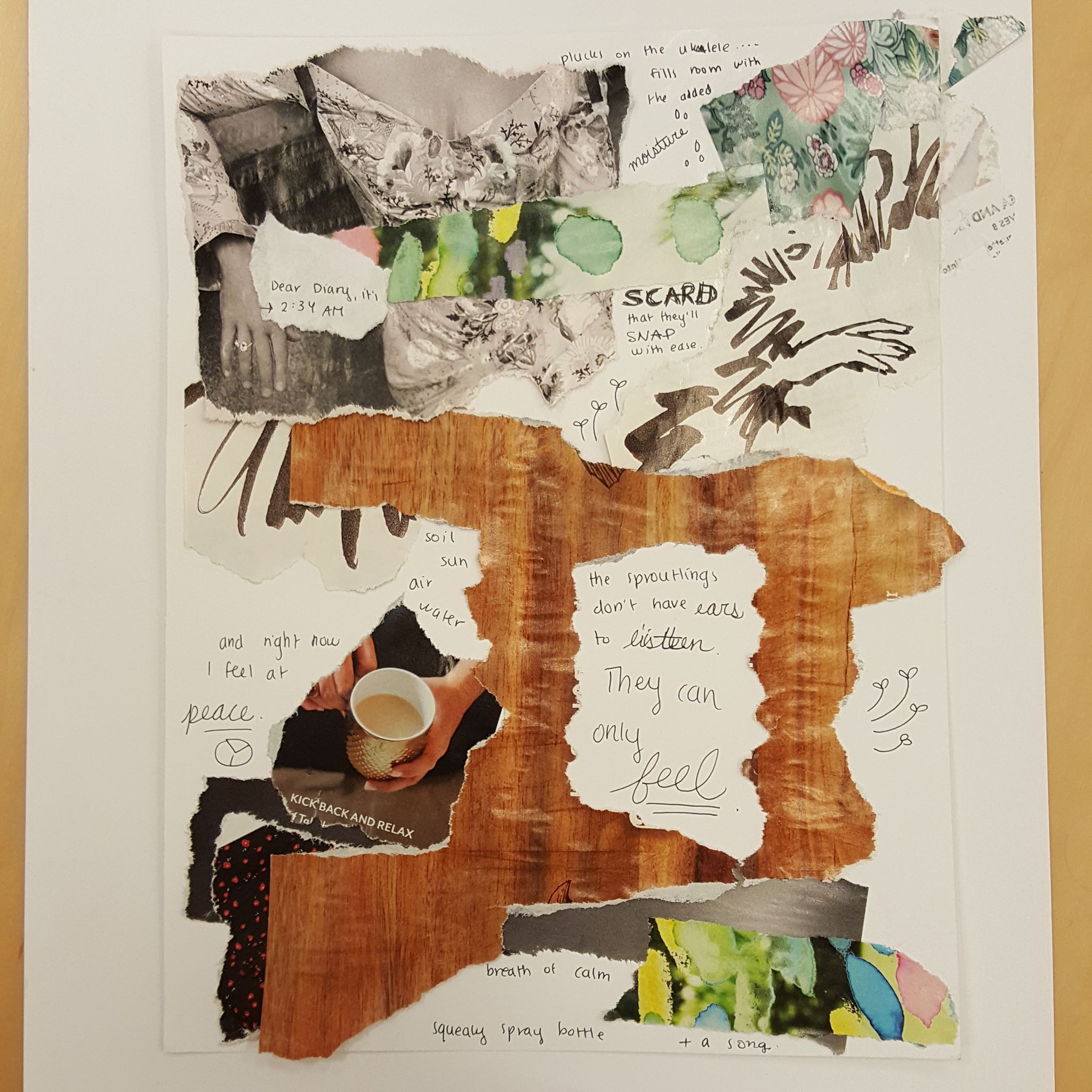
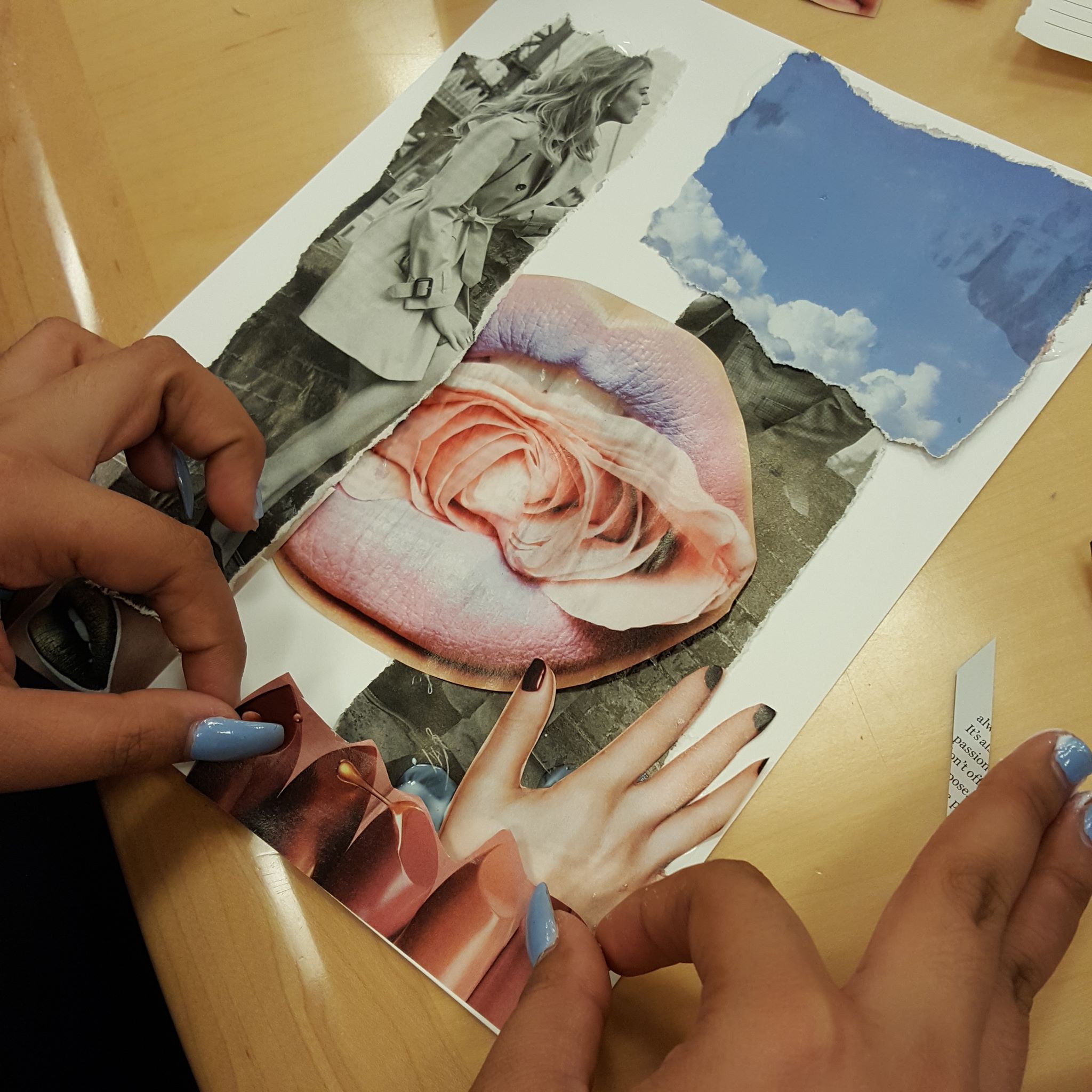
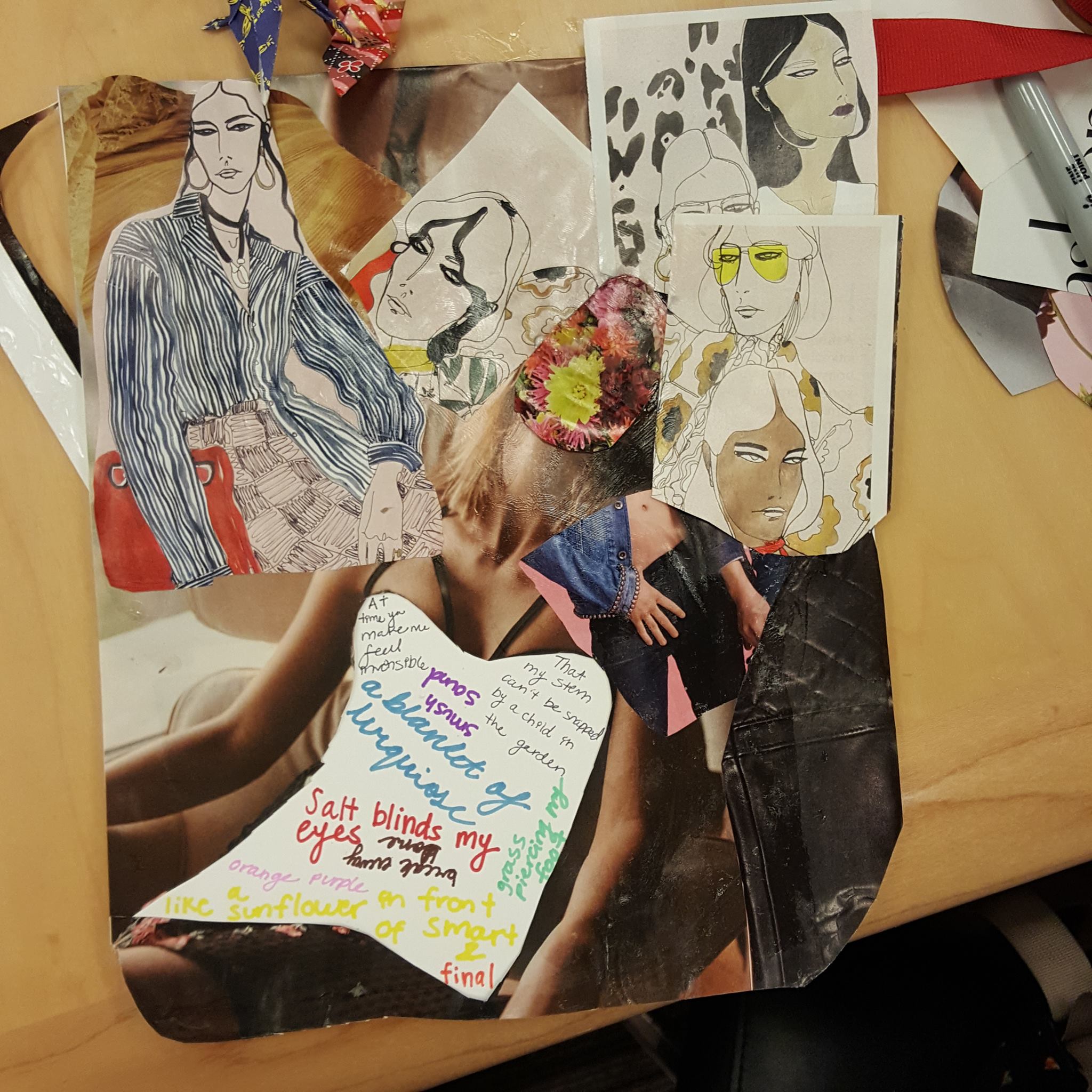
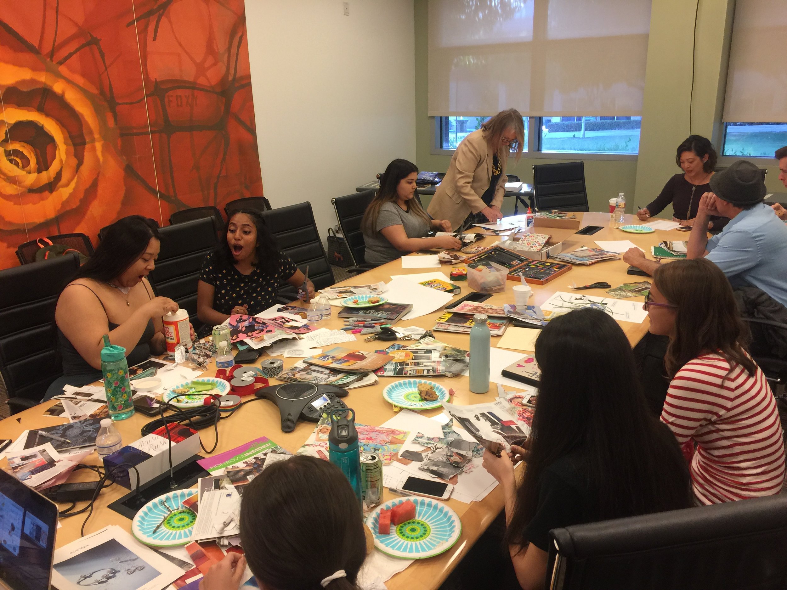
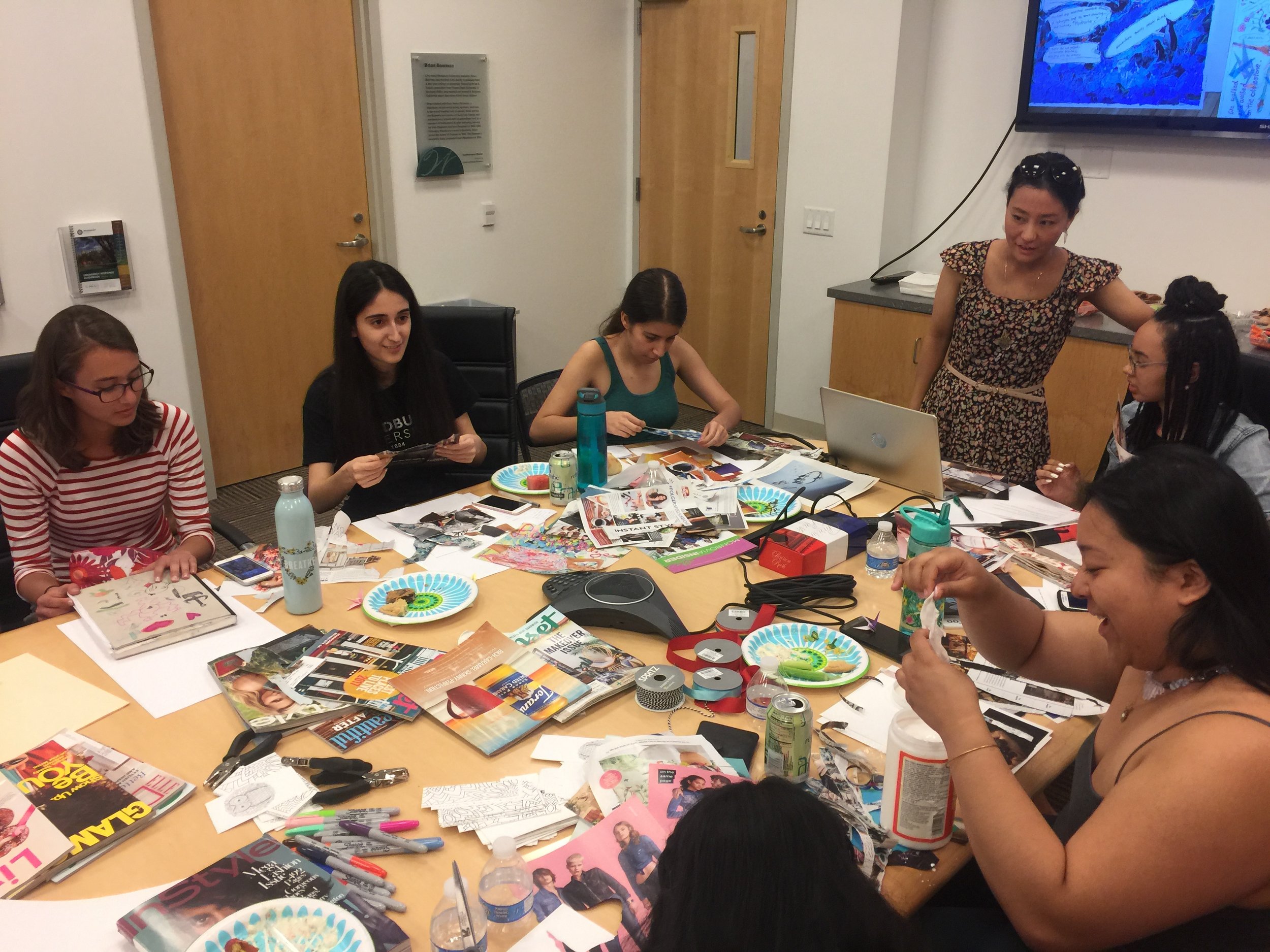
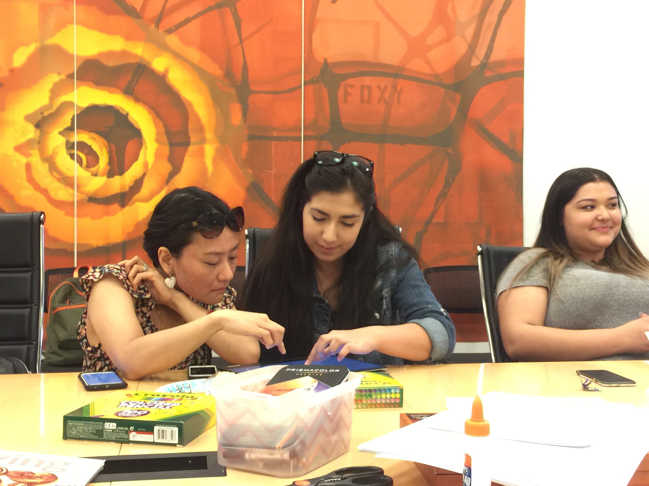
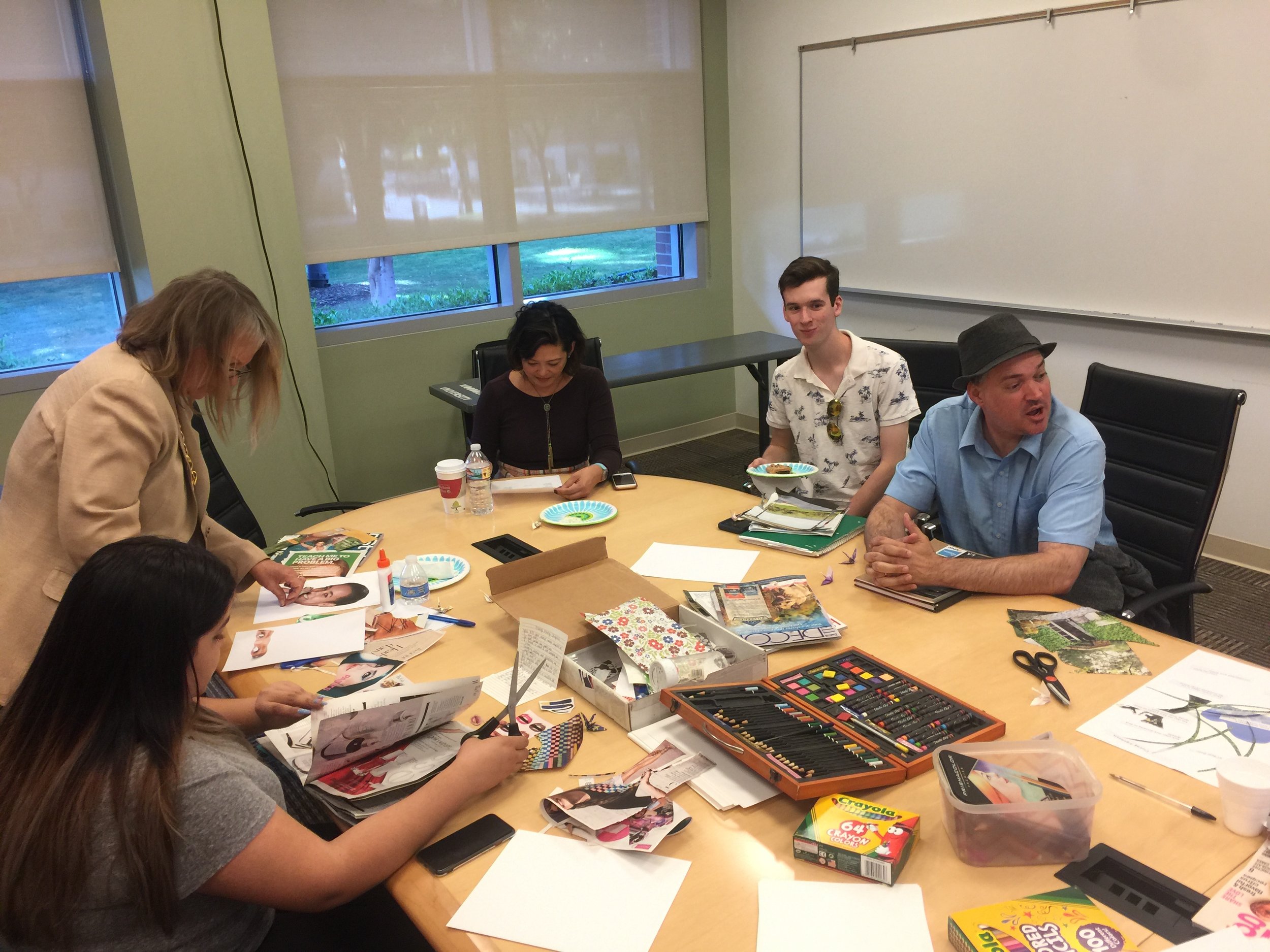
On April 23rd, 2018, renowned poets Naoko Fujimoto and Angela Narciso Torres, led a graphic poetry workshop at Woodbury University, where students brought poems in text and then transformed them into graphic poems. Hosted by MORIA Literary Magazine, the event was a booming success, with students not only being mentored by two iconic poets, but also exploring the fascinating medium of graphic poetry. Fujimoto spearheaded teaching the students the graphic side of the poetry (being a graphic poet herself), and Torres—the author of the acclaimed poetry collection, Blood Orange (2013 Willow Books Literature Awards Grand Prize Winner for Poetry)—led a roundtable workshop, where the group read and discussed each other’s work. Fujimoto and Torres both also presented their own work to the class, giving them a general idea of what to cultivate during the workshop. Art papers, magazines to cut up, stamps, markers, glue, glitter, ribbons, and other resources were provided by MORIA for the students to fully delve into their creations. Below this article is a slide show featuring the students who participated in this workshop and some of their resulting creations.
Fujimoto specializes in the genre of “graphic poetry,” developing her own translation of what it is to her. Her books Mother Said, I Want Your Pain (Shared Dream Immigrant Chapbook Contest at Backbone Press), Where I Was Born (the editor’s choice at Willow Books) and her first chapbook, Home, No Home (Oro Fino Chapbook Competition at Educe Press) are just a couple of her award-winning, standout works. Her process involves creating a picture-scroll known as an emaki, an ancient and enduring Japanese style. Through this, she then demonstrates what her poem means through art and graphic design, sometimes replacing words with an image to demonstrate what it represents. The format she usually likes to follow is to have about 30% of the poem be words and the rest be pictures. Her first graphic work, “The Duck’s Smile” explored overlooked abuse in everyday life, but Fujimoto found this rendition not what she was searching for. Her later work, such as “Radio Tower,” finds the perfect balance, fully balancing both words and imagery. Fujimoto finds that graphic poetry is “trans-sensory,” able to appeal to numerous senses that a normal poem in text may not able to connect to.
Below is Fujimoto’s graphic poem “Pochi-graphic,” based on her original poem “Pochi or Kuro”:

“POCHI-GRAPHIC"
Naoko Fujimoto’s poem, “Pochi or Kuro,” was published in MORIA’s Issue One (2017). We will reproduce the original text below so that you can compare it to the completely transformed graphic poem, “Pochi-graphic,” above, which we publish here for the first time. We’ve enlarged the visual field so that readers can see that, the words have been integrated into the images so that a wholly new piece of poetry results. The visual elements speak to the text, and vice-versa, with the echoes of the “graveyard” appearing in the cut-out rectangle papers lining up in rows, and the text itself meandering down the page, sometimes right-side up, sometimes upside-down, as unsettled as the relationship portrayed in the lines.
Pochi or Kuro
Following
the ghost dog down, Father implanted a stroke.
It is resting in my great uncle’s
side of the graveyard with people I had
never talked to. Mother said, “The dog should not be here.
Bad luck for ancestors and descendants.” Father used to say,
“It ate its own shit.” Its name was forgotten; Pochi or
Kuro, a common Japanese dog’s name. When
Father jogged in the morning, the dog
waited by the telephone pole. It barked,
and Father replied, “I am struggling with a new
computer system.” The dog sniffed
his hand as if saying, I smell nappa-cabbage. It licked
him three times, Don’t drive today.
You partial,
vegetable.
While not graphic poetry, per se, Cate Roman, a graphic designer and professor at Woodbury University, also manages to combine both art and language into something more. Recently she partook in a collaboration between the Creative Writing students at Mount Saint Mary’s University and students in Graphic Design at Woodbury University. This collaboration, “Call and Response,” had the creative-writing students creating poems that the graphic-design students would then cultivate into visual works of art. While Roman regularly participates in school-based projects like this, she strives for very intricate and complex work. Through physical letters and words, Roman manages to create entire stories through cut-paper and sculpture. Her works of paper range from 1,500,000 of Us to Three Bales, with sculptures like Exquisite Flaws and White Noise also perfectly capturing a balance between imagery and words. Roman, like Fujimoto, did not find this balance overnight; Roman started out as a performer. From working as a dancer in TV series to performing on musicals, Roman seemed destined to always express herself. After she retired from performance art, though, she proceeded to take a graphic design class through the UCLA Extension program. From there, she was inspired by the use of imagery and sought to take it by the reigns and make a second career of it.
Below are some images of the “Workshop on Graphic Poetry” and some of the work produced that day by the students and professors in attendance:

David B. Newell
Originally from Arizona, David Newell chose to go to school in California for what he calls its “free and wild” atmosphere. At Woodbury University, he is majoring in Animation and minoring in Professional Writing. He calls himself an oddball and has an infinite love for rollerblading and entomology. His goal is to one day create his own animated television show.